Making the case for a navigation fix with working prototypes
Without the authority to decide, I split the problem into 19 issues and showed how much each of three options solved
It started with a prototype the CEO built
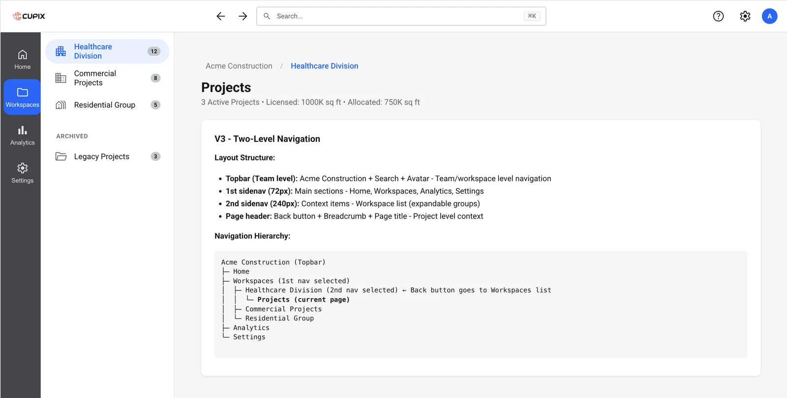
While applying the design system to PAC (Project Admin Center) to test it on a real feature, I had to review the navigation of an early prototype the CEO had vibe-coded. PAC is the hub admins use to reach every feature, and with four levels of depth and layers of tabs it was hard to tell where you were. The decision-maker wasn’t a designer and my authority was limited, so explaining it in words wasn’t going to land.
Classification instead of opinion
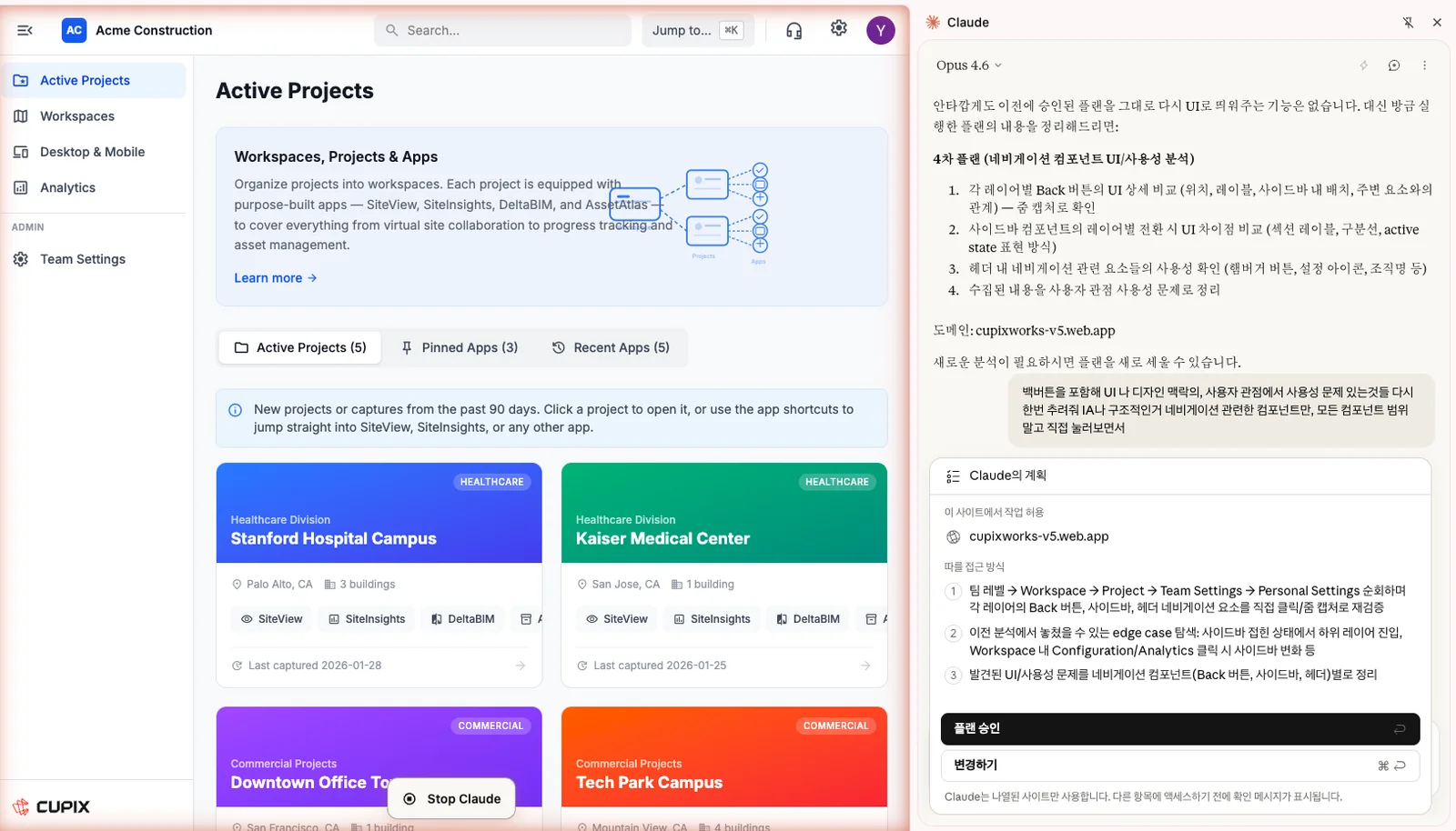
I gathered issues through a design team review and walked every entry and exit path at every depth with Claude in Chrome. Together, that gave 19 issues across four areas: IA, side nav, wayfinding and top bar.
Walking every path of the real prototype with Claude in Chrome
Three options as working prototypes
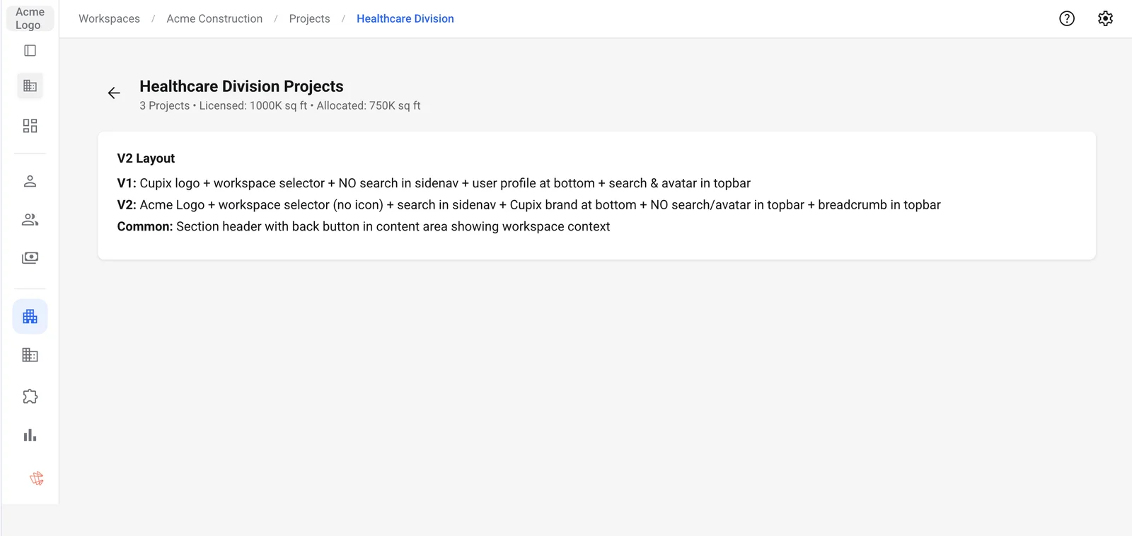
I built three options, from a small fix within the allowed scope to a fundamental redesign, as working prototypes in Storybook, and counted how many of the 19 issues each one solved.
Option 1 · Minimal fix
5 / 19
Cleaned up toggle ownership, back placement and duplicate search. The structural problem stayed.
Option 2 · Middle ground · Adopted
9 / 19
Breadcrumbs and unified search fit within the cost the team could take on now.
Option 3 · Full redesign
17 / 19
A rail and panel layout solved the most causes, but a full overhaul cost too much.
The adopted option 2
Option 2 was adopted, bringing breadcrumbs and a better navigation structure, and a core feature didn’t ship with a serious navigation flaw. Option 3 stays as a working demo, proposed as the next direction.
When I see a problem at the core of a product, even without the authority to decide, I learned to persuade with evidence, classification, alternatives and prototypes rather than argument.
Standards and operations behind redesigning 191 custom icons
Icons that didn’t match
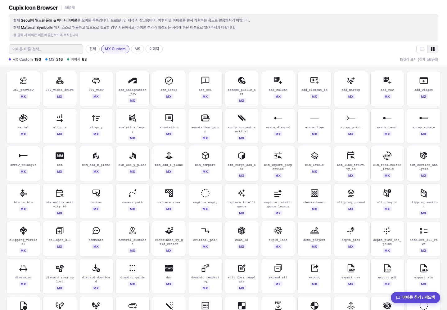
Our custom icons had been drawn without clear standards, so their styles varied and clashed with Material icons on the same screen. All 191 had to be redrawn in one style that sits naturally next to Material, split across six designers.
Standards first, with a tool to check them
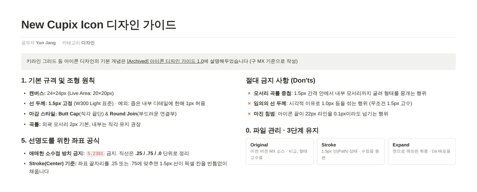
I first set rules like stroke weight, padding and cap style so anyone would get the same result, and built a Gem trained on them so designers could check while working instead of looking up the guide.
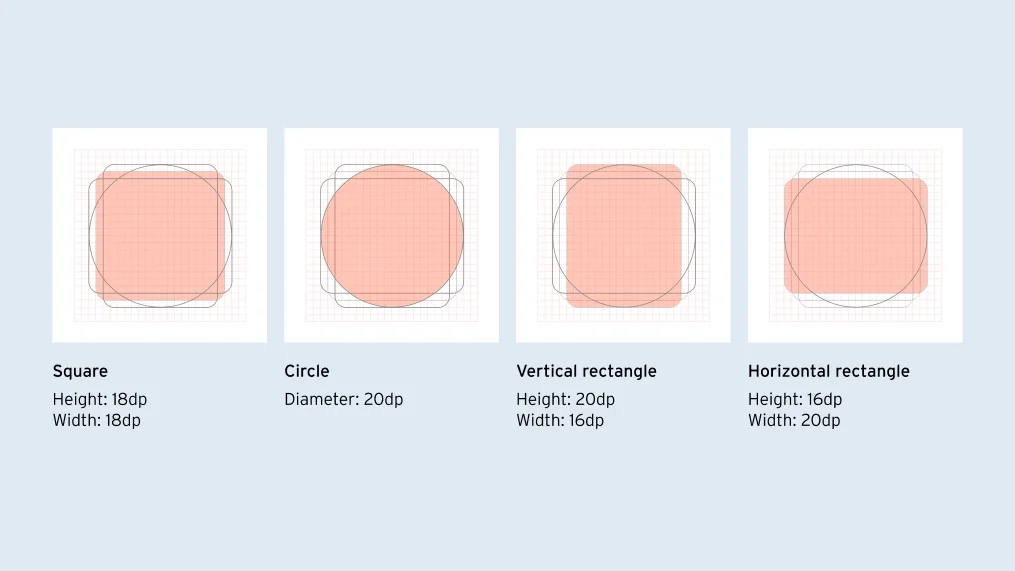
Icon design guideKeylines by shape
Split, check, build
I sorted the icons by type, made example pieces and assigned them to six designers in separate files. Designers checked their own work with the guide and the Gem, and I did the final review. Reviewed icons were built into a font with Material and applied to the product through a web icon browser.
Turning repetitive design system work into AI skills
Icon changes that had to go through engineers
Adding or renaming an icon meant an engineer handling file paths and build commands. Writing issues, checking for duplicates, describing PRs and reporting to the team lead were all repeated by hand, every time.
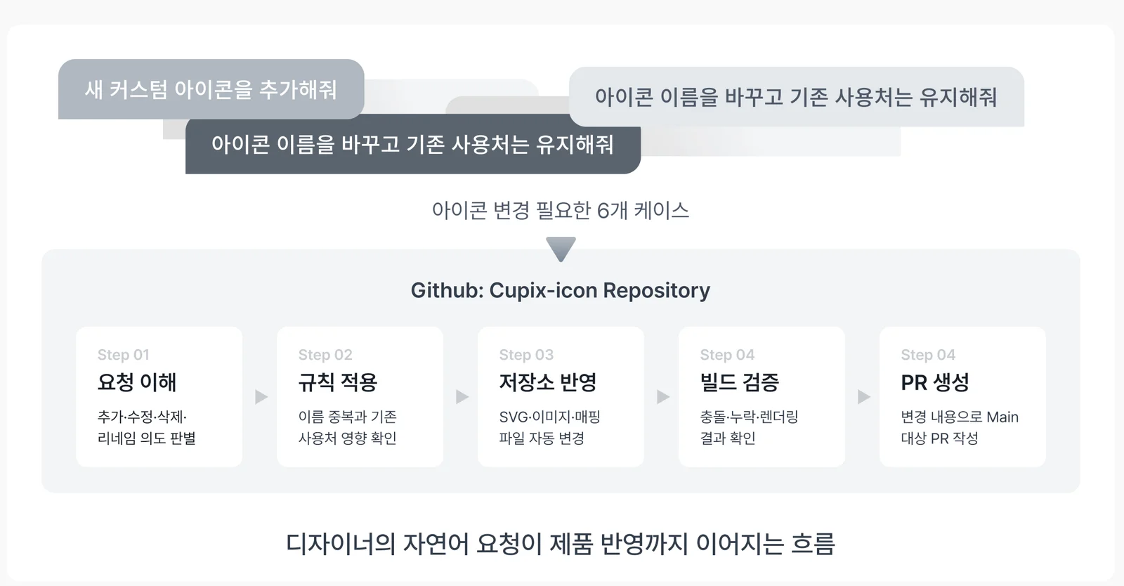
Five steps from request to PR
Now a designer asks in plain words, such as “add a new custom icon” or “rename this but keep existing usages,” and the skill carries it through understanding the request, applying the rules, updating the repository, verifying the build and opening a PR. Name collisions and effects on existing usages are checked in the rules step, and a person reviews the final PR.
Icon work from a plain-language request to a PR
Same change, different readers
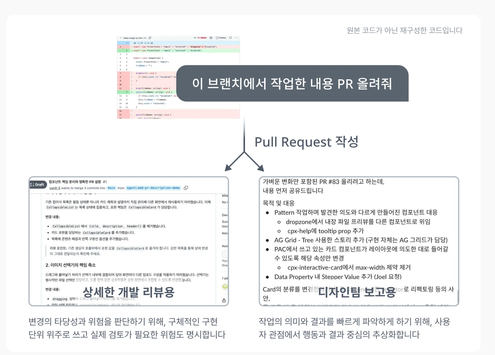
I also built a skill that searches existing issues before writing a ticket in the team template, and one that groups commits by topic to write a PR description for engineers and a plain summary for the team lead.
One request, two write-ups: engineering review and a summary for the team lead
I learned that making work efficient isn’t only about saving time; it’s about giving repeated decisions and communication a consistent structure.
Team knowledge · 2025 ~ 2026
Building a knowledge base for the design team
150+ sources, organized in NotebookLM by the kind of question
Context you could only get by asking
Construction digital twins are a complex domain, and context about the product and projects was scattered across documents, videos and people’s memories. Asking a colleague answered the question, but not the industry context behind it, and the resource and support center material was written for customers and fragmented.
Notebooks split by the kind of question
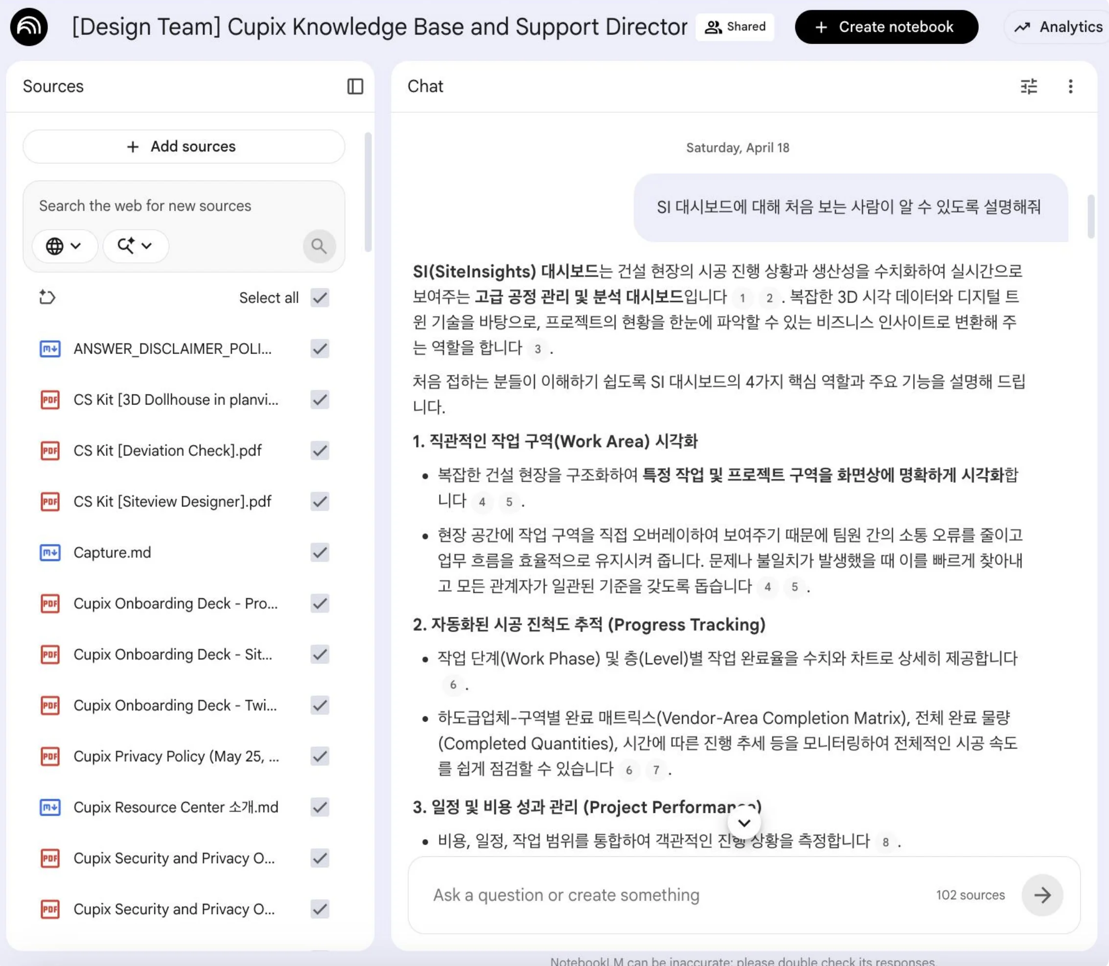
I collected 150+ sources and split them into two notebooks by purpose, a product reference and project context, then shared them with the team so anyone could ask when something was unclear.
The design team’s notebook answering a question about the SiteInsights dashboard
A new designer’s first task
A new designer’s first task, “find ways to improve the service,” had no clear scope or starting point. I suggested using the notebooks to map the main user groups and key journeys first, then analyze pain points step by step. The new designer worked through the task that way, and the result was well received internally.
I learned that in a complex domain, productivity comes less from individual memory and more from a knowledge structure the whole team can reach.
Research · 2024
Finding requirements in blood-pressure app interviews
Checking records, bringing them to appointments, family use: three needs and the screens they led to
Interviewing five users and a physician
As a UX/UI design intern at KOROT, I interviewed five blood-pressure monitor users and one physician to find how the app could help beyond logging: how people measure and record, how records get to appointments, how families share a device, and how the physician reads those records.
Checking records
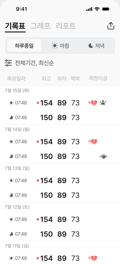
Users and the physician both cared more about individual readings than averages. They needed a log showing time, blood pressure and pulse at a glance.
Bringing to appointments
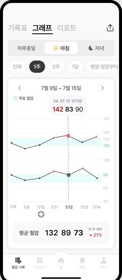
App records didn’t carry into appointments, so people printed them or kept separate notes. They needed to pull up the right period before a visit.
Family use
Families shared one device, so readings got mixed, and people wanted to see each other’s blood pressure. They needed separate records per person and family sharing.
From requirements to screens
A log built around individual readings, with irregular ones markedA graph for pulling up the period needed before a visit
In usability testing, target users responded positively to the accessibility and clarity of the design.