Making the case for a navigation fix with working prototypes
Before locking the layout components, I diagnosed 19 navigation issues, compared three structures as working prototypes and got one into the product
Before locking the layout components
Before locking layout components like SideNav and TopBar in the design system, I first reviewed the navigation of PAC (Project Admin Center), where they would live. PAC is the hub admins use to reach every feature, and across its four levels (Team, Workspace, Project, Settings) it was hard to tell where you were.
It was a structural problem that polishing components wouldn’t fix, and the call to change the structure wasn’t mine. So instead of offering an opinion, I made the problem countable and the alternatives something people could click through.
Design team review and an AI walk through every path
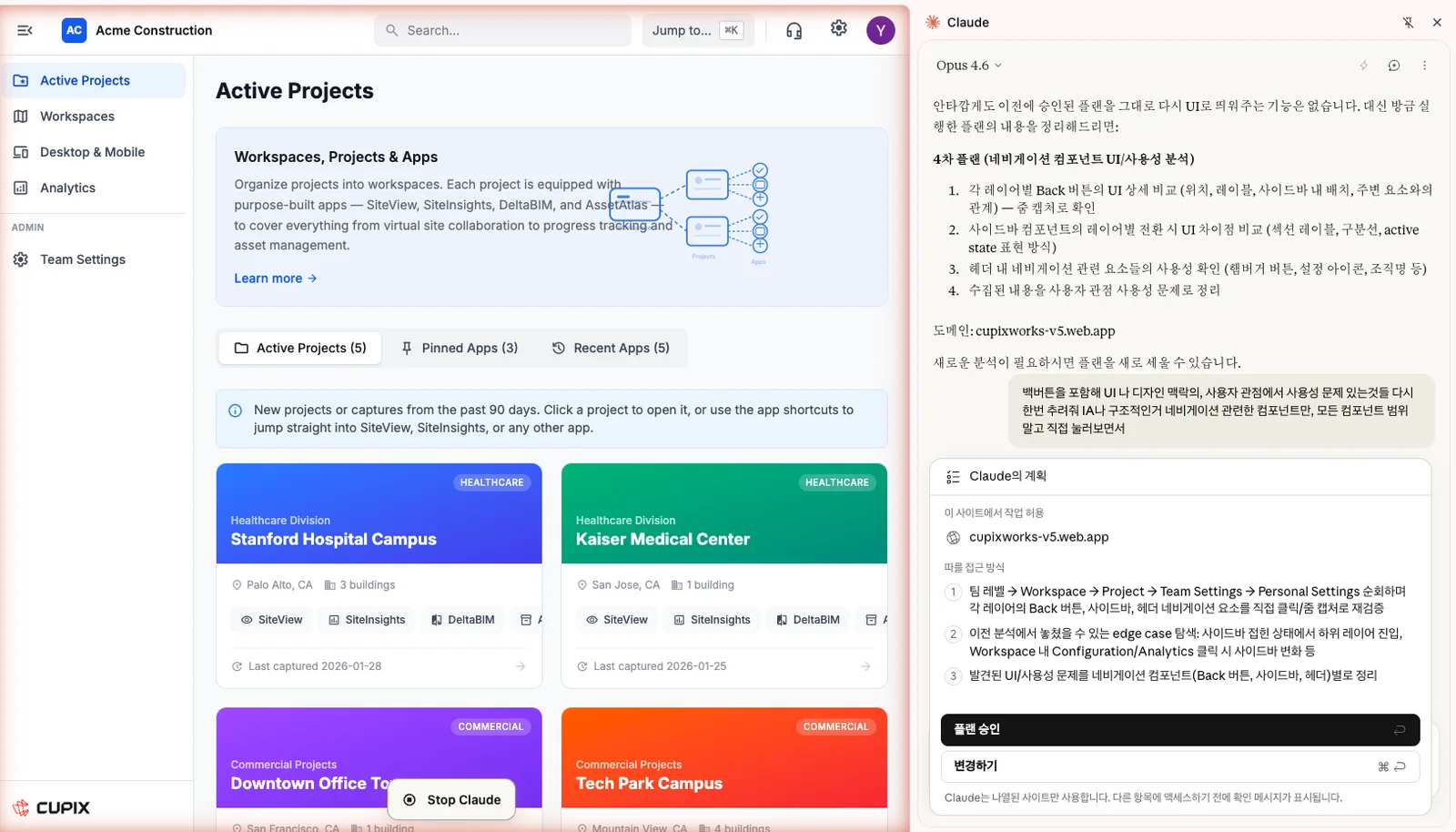
I first gathered the main issues in a design team review. Separately, I had Claude in Chrome walk every entry and exit path at every depth, checking whether you could see where you were and how to get back. Combining what people noticed with an exhaustive walk kept gaps to a minimum.
Walking every path of the real prototype with Claude in Chrome
19 issues in four areas
I sorted the combined 19 issues by where their cause sat: IA structure, side nav, wayfinding and top bar. Grouping them this way gave a yardstick for how far each option went.
IA structure3There was no clear home, and layouts and menu names stayed the same across depths, so you couldn’t tell you had gone deeper.
No defined home
Same layout at every depth
Same menu names repeated across depths
Side nav4The nav was swapped wholesale at each depth, with nothing showing what was always there or which areas needed different permissions.
Looks global, behaves local
Context lost on swap
Section labels doing two jobs
Admin area barely separated
Wayfinding5Nothing showed the current path, and the only way back was a Back button whose destination and label changed from screen to screen.
Back ignores where you came from
Inconsistent Back labels
Back looks like a menu item
Unreachable when collapsed
No breadcrumbs
Top bar7The top bar and side nav overlapped, so several destinations had two entry points, and icons alone didn’t say where they led.
Toggle lives in the header
Two toggle icons
Search vs. Jump to
Gear opens team settings
Duplicate settings entry
Unclear headset icon
Blurred top bar/side nav ownership
Three structures as working prototypes
Instead of static mockups, I built the three options as prototypes so the same paths could be clicked through and compared, and counted how many of the 19 issues each one solved.
Option 1 · Minimal fix
Start on the Healthcare Division projects page
The side nav toggle moves into the side nav
Back moves out of the menu, into the content header
Still open: going up swaps the side nav entirely
IA structure
Side nav
Wayfinding
Top bar
5 of 19 solved
Solved
Removed the duplication between the header and the side nav
Still open
The side nav still swaps at every depth
Option 2 · Middle groundAdopted
Start on the Healthcare Division projects page
Breadcrumbs show where you are
Search moves into the side nav; the top bar keeps global actions
Still open: the side nav still swaps when you go up
IA structure
Side nav
Wayfinding
Top bar
9 of 19 solved
Solved
You can always see where you are, and the top bar and side nav each have one job
Still open
The side nav still swaps, and there are two ways up: Back and breadcrumbs
Option 3 · Full redesign
Start on the Healthcare Division projects page
The global rail never moves
The panel shows where you are
Going up keeps the rail and panel; no Back needed
IA structure
Side nav
Wayfinding
Top bar
17 of 19 solved
Solved
The side nav’s identity problem is solved by structure, and the Back problems go with it
Still open
The cost of a full overhaul
Adopting option 2 and shipping it
Side by side, the side nav swapping at every depth was solved only in option 3.
Option 1
5/19
Option 2Adopted
9/19
Option 3
17/19
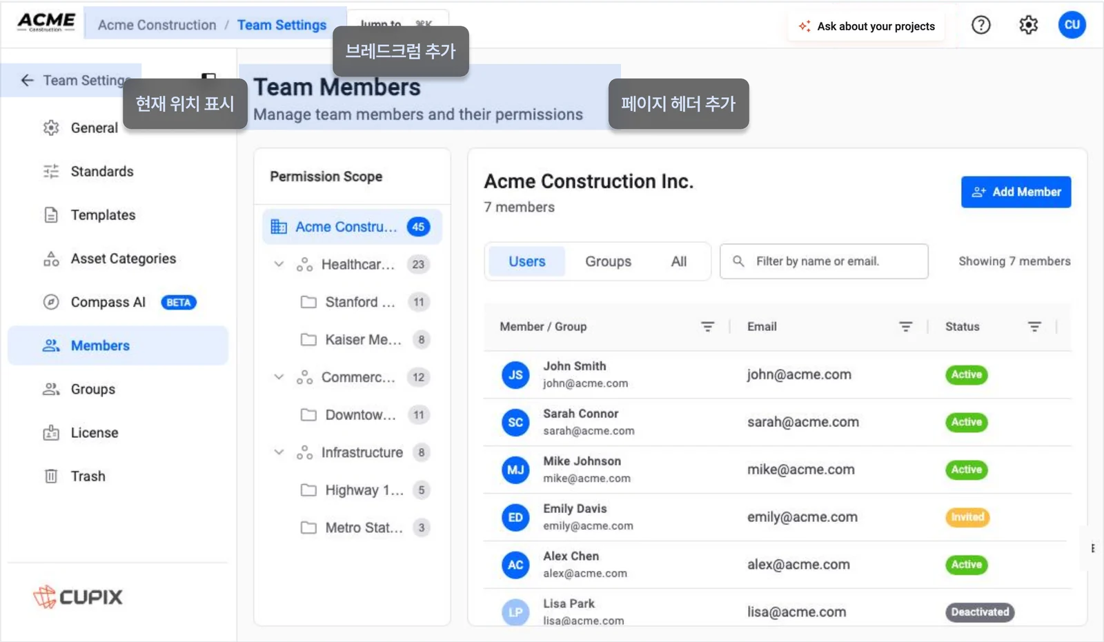
The decision-maker weighed the cost of the change and what was in scope, and chose option 2. I added breadcrumbs to the top bar, the current location above the side nav and a page header in the content area, and split settings into general settings and member management. The same rules went into the design system’s layout components and patterns.
Option 2 in the product: breadcrumbs, current location and a page header
The navigation problems were fixed before a core feature shipped, and option 3 stays as a working demo, proposed as the next direction.
Even without the authority to decide, a problem at the core of the product could be argued with evidence, clear categories and working alternatives rather than opinion.
Designing a blood pressure app from user interviews
I interviewed five users and a physician, found three needs and designed the screens for them
For a KOROT internship project on the next version of a home blood-pressure monitor app, I looked for how the app could help beyond logging. I met people who use an app, stopped using one, or never did, and heard how a physician reads those records.
Five users
Participant
How they record
Why · pain point
In their words
21, maleUses an app
Reads the log in the app; exports and prints it for visits
Deletes family readings that mix in
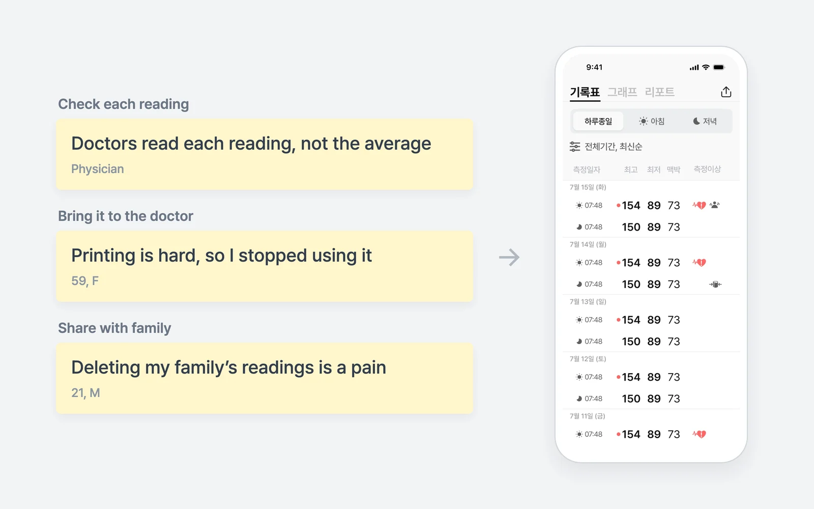
“Deleting other people’s readings one by one is a real pain.”
42, femaleUses an app
Tracks sugar and pressure in the app; writes a separate doc for visits
Auto-logging is easy, but visit notes are extra work
“It logs automatically over Bluetooth. That part is easy.”
64, maleNo app
Paper log for 15 years
Used to paper; never considered anything else
“I’m used to it, so it isn’t a hassle. I’ve never looked at other options.”
40, femaleStopped
Quit over connection errors and resets; tried to add her parents
Hard to connect and register; little useful info
“You redo setup whenever the device changes, and there were errors, so I stopped.”
59, femaleStopped
Writes visit records by hand; wants to share status with family
Connecting and printing are hard; no better than a notebook
“It isn’t much different from a notebook, and printing is hard.”
One physician
Individual readings
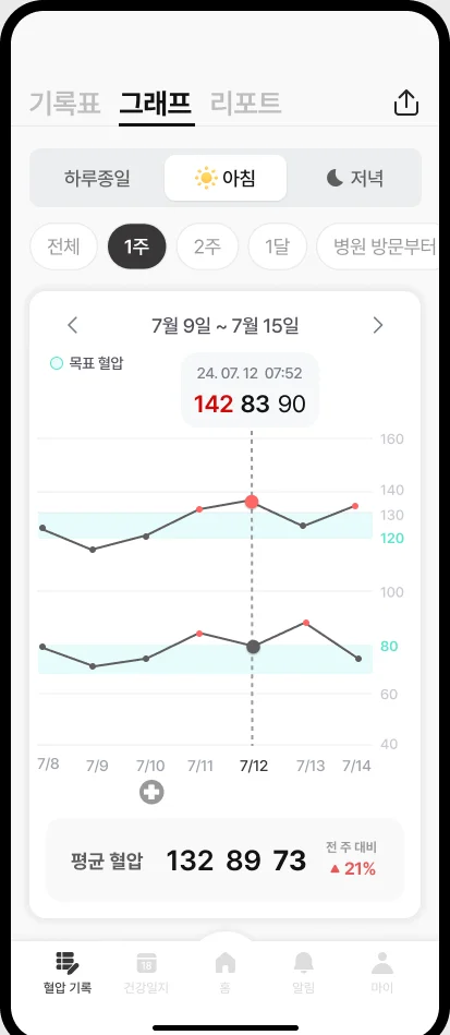
Reads individual readings over averages, morning against morning
How records arrive
Prefers links to existing platforms over a new app
Time
No time in a visit to go over lifestyle
Three requirements
Checking records
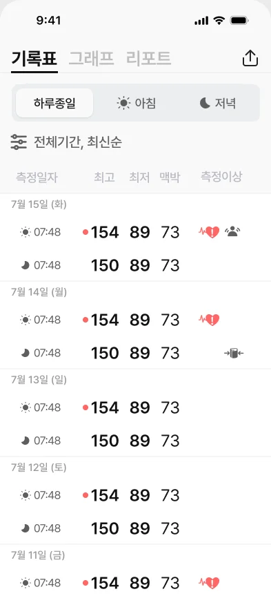
21, maleMostly reads a table of date, time, pressure, pulse
PhysicianIndividual and recent readings over averages
A log showing time, pressure and pulse at a glance
Bringing to visits
21, maleExports and prints from the app
42, femaleWrites a separate doc for visits
59, femaleBack to paper; printing is hard
PhysicianRecommends existing platforms
Print-ready records and existing hand-off routes
Family use
21, maleDeletes mixed-in family readings
40, femaleGave up adding her parents
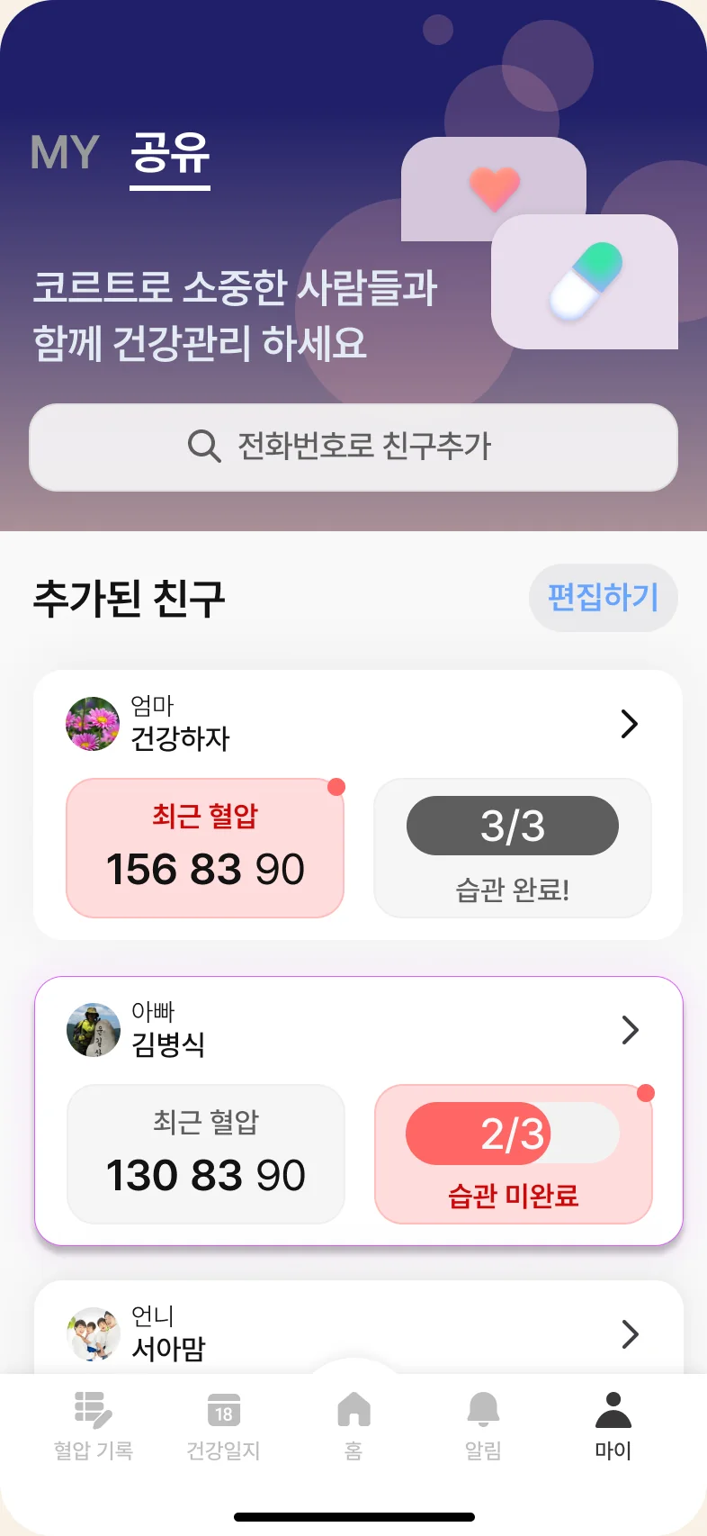
59, femaleWants to share readings with family
Separate records per person; family sharing
From requirements to screens
Log of individual readings, irregular ones markedMorning/evening views and visit-based periodsFamily blood pressure and medication status
I sent the design to a few users who matched the target, and they responded well to how accessible and clear it was.
Design system · 2026
Organizing UI decisions around eight user intents
Eight intents, 14 patterns, components and rules, structured so people and AI read the same thing
Components didn’t say what to use when
However many components we had, choosing the right one in a given situation was left to each designer’s experience. The same request produced different screens from different designers, and AI, with no rules to follow, just lined components up.
Classified by intent, not by action
Filtering, searching and scrolling are only means. Sorting by what the user is trying to achieve meant the same filter could lead to different patterns depending on the situation.
Using filters to see the state of issues
monitor-state · The filter is a means; understanding the state is the goal
Wanting to save a search setup
provide-input · The goal is saving, not filtering
Browsing a list, then opening one item
select-and-confirm · Browsing is the means; choosing is the goal
From intent to rule
For each of the eight intents I linked a pattern, the components that build it and the rules for using it. There are 14 patterns in total, and the rules cover states and edge cases.
Loading, empty and submitting are all defined as states
Recoverrecover-or-cancel
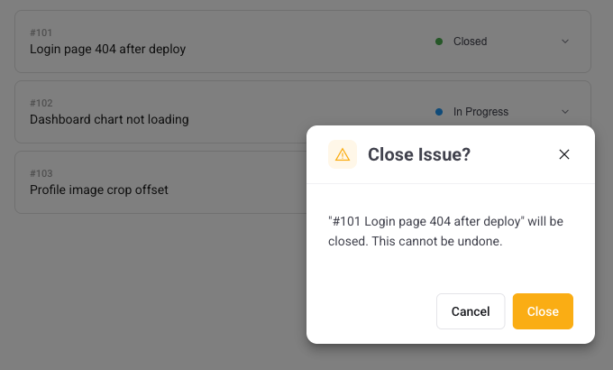
confirm-action · state-transition
cpx-confirm-dialog · cpx-toast · cpx-button
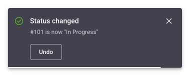
Reversible changes offer a 6-second undo instead of a confirmation
An example: changing status in bulk
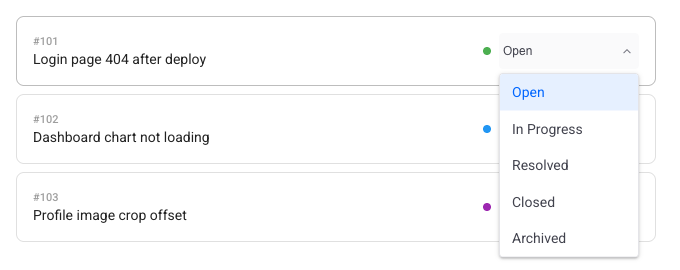
A request like “find all open issues and mark them resolved” is classified as change-state and follows the three rules of the state-transition pattern: change it in place, confirm risky changes, and offer a 6-second undo when the change is reversible.
In place: change status without leaving the listRisky changes: an explicit confirmationReversible: a 6-second undo
Principles for people, an index for AI
Each pattern is documented as an MDX guide, and the links between intents, patterns and components live in an auto-generated index (index.yaml). People read them as design principles; AI reads the same rules as structured data.
File paths and builds engineers handled by hand, now an AI skill with our rules and build checks included
Icon changes that had to go through engineers
Adding or renaming an icon meant an engineer handling file paths and build commands. Writing issues, checking for duplicates, describing PRs and reporting to the team lead were all repeated by hand, every time.
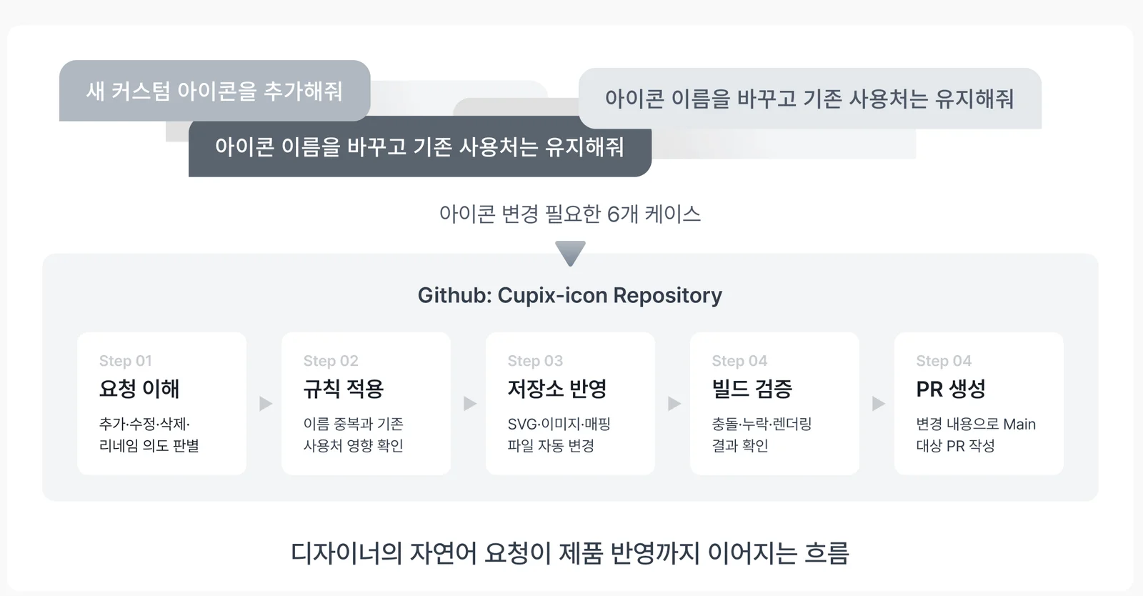
Five steps from request to PR
Now a designer asks in plain words, such as “add a new custom icon” or “rename this but keep existing usages,” and the skill carries it through understanding the request, applying the rules, updating the repository, verifying the build and opening a PR. Name collisions and effects on existing usages are checked in the rules step, and a person reviews the final PR.
Icon work from a plain-language request to a PR
Same change, different readers
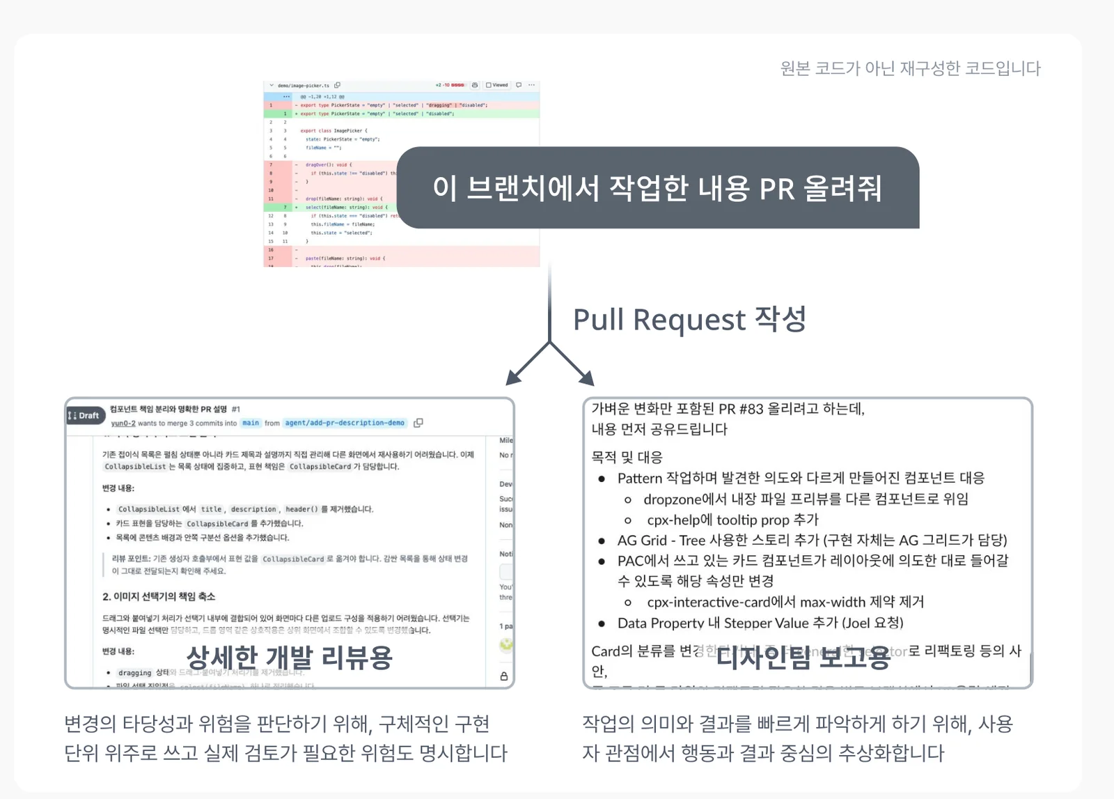
I also built a skill that searches existing issues before writing a ticket in the team template, and one that groups commits by topic to write a PR description for engineers and a plain summary for the team lead.
One request, two write-ups: engineering review and a summary for the team lead
I learned that making work efficient isn’t only about saving time; it’s about giving repeated decisions and communication a consistent structure.
Design decision · 2025
Setting bottom sheet rules for a product with no mobile standards
Four types by purpose rather than shape, and a Claude Project that picks the type when you describe a screen
The same questions on every screen
CupixWorks is a desktop web product, so there were no mobile rules. Moving the screens the Cupix Vista beta needed (web sign-up and Project Center’s card details, search and filters) to mobile, the same bottom sheet raised the same questions on every screen: can it be dragged closed, and does it need a Done button?
Four types by purpose
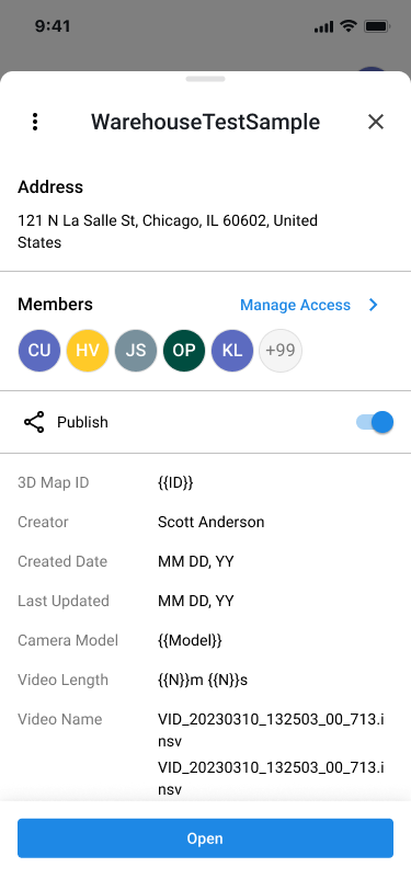
I classified sheets by what they’re for, not how they look. For each type I set whether it can be dragged closed, whether it needs a bottom CTA and what it’s built from, and wrote it up as a team guide.
Explore Exploring
Exploring the space with the sheet open
Drag to close
Used to adjust height
Bottom CTA
None
Built with
Handle · Drag · Detent
Task Completing a task
A task that ends with save or apply
Drag to close
Not allowed · prevents lost input
Bottom CTA
Required
Built with
Fixed flow · CTA
Info Checking and choosing
Checking information and choosing
Drag to close
Allowed · nothing is lost
Bottom CTA
Only when needed
Built with
Header · Close
Action Acting right away
Choosing runs the action
Drag to close
Allowed
Bottom CTA
None
Built with
A short action list
Applied to real screens
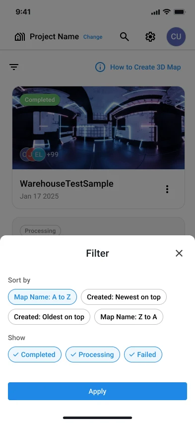
Info · Card detail: no input to lose on close, and Open navigates rather than completes.Task · Filter: nothing applies until you press Apply, so it can’t be dragged closed and has a fixed bottom CTA.
The same rules without memorizing the guide
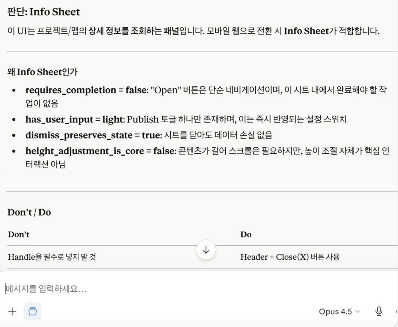
A guide alone didn’t guarantee the next screen would get the same call. So I built a Claude Project that suggests the type, the reasoning and the build rules when you describe a screen and its context, and shared it along with the guide.
Standards and operations behind redesigning 191 custom icons
Icons that didn’t match
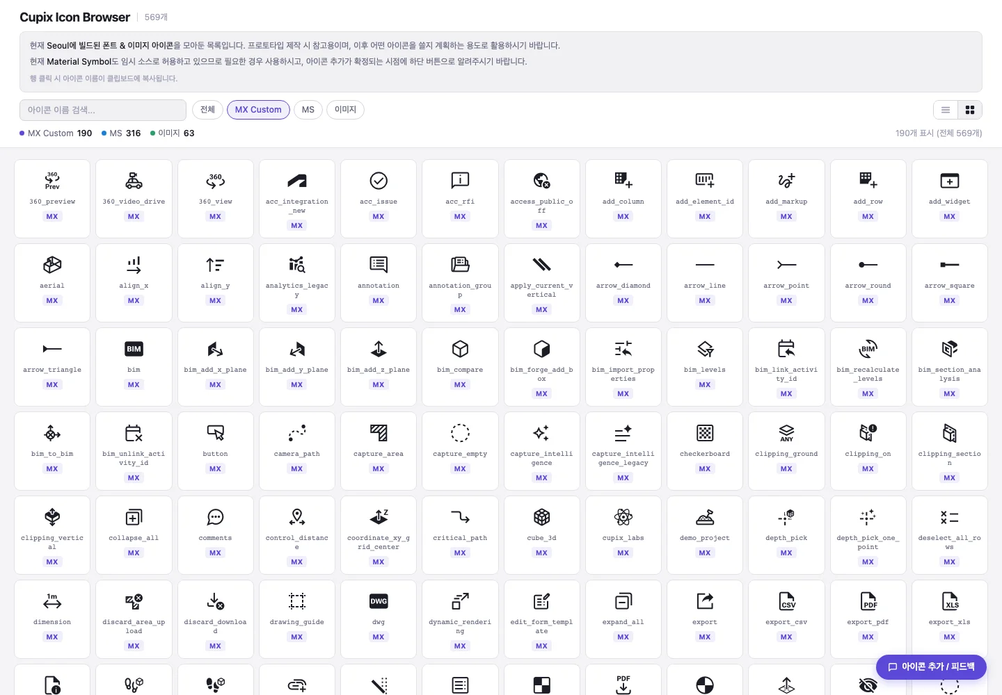
Our custom icons had been drawn without clear standards, so their styles varied and clashed with Material icons on the same screen. All 191 had to be redrawn in one style that sits naturally next to Material, split across six designers.
Standards first, with a tool to check them
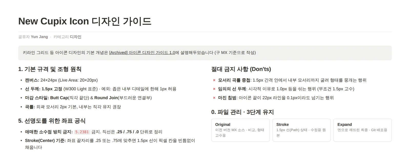
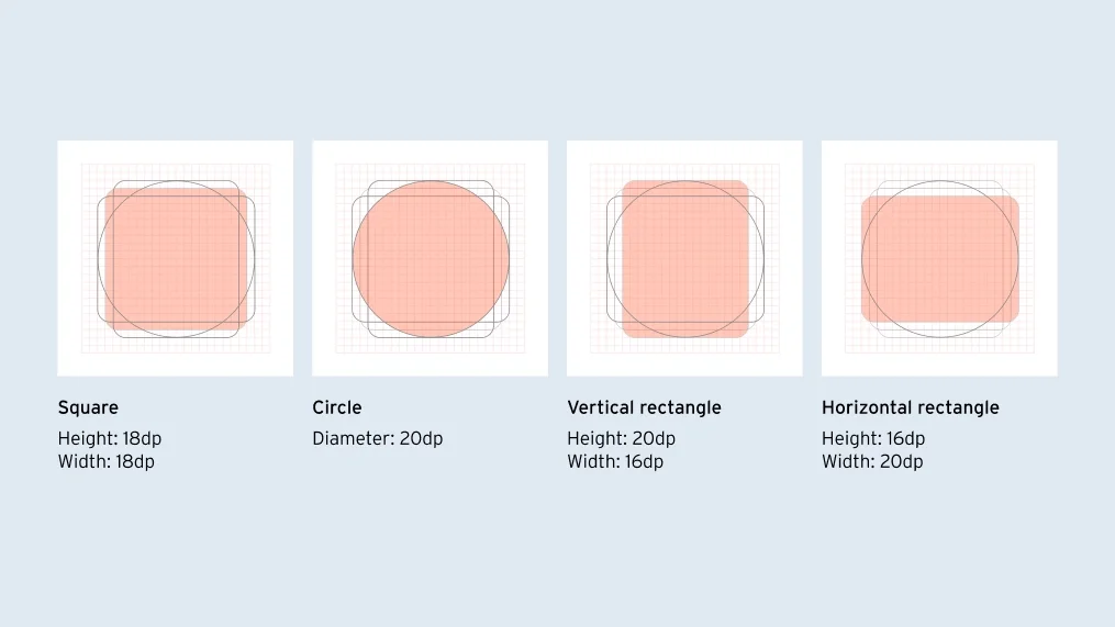
I first set rules like stroke weight, padding and cap style so anyone would get the same result, and built a Gem trained on them so designers could check while working instead of looking up the guide.
Icon design guideKeylines by shape
Split, check, build
I sorted the icons by type, made example pieces and assigned them to six designers in separate files. Designers checked their own work with the guide and the Gem, and I did the final review. Reviewed icons were built into a font with Material and applied to the product through a web icon browser.
Six designers’ work gathered in one file, side by side by designer, reviewed for one consistent style191 icons unified into one style, built into a font with Material and released to the productSee the design system case this belongs to
AI workflow · 2025–26
Building a knowledge base for the design team
150+ sources, organized in NotebookLM by the kind of question
Context you could only get by asking
Construction digital twins are a complex domain, and context about the product and projects was scattered across documents, videos and people’s memories. Asking a colleague answered the question, but not the industry context behind it, and the resource and support center material was written for customers and fragmented.
Notebooks split by the kind of question
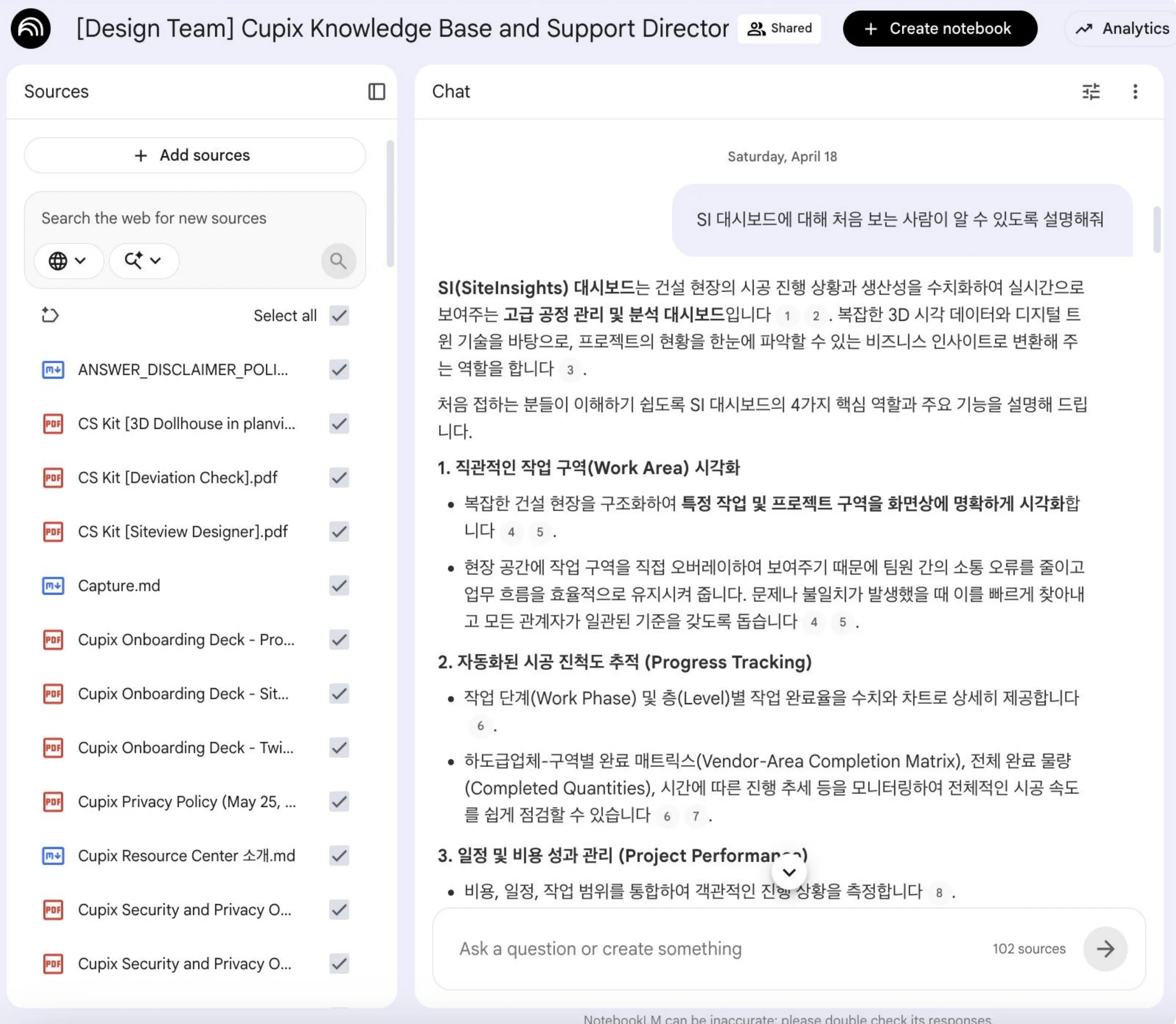
I collected 150+ sources and split them into two notebooks by purpose, a product reference and project context, then shared them with the team so anyone could ask when something was unclear.
The design team’s notebook answering a question about the SiteInsights dashboard
A new designer’s first task
A new designer’s first task, “find ways to improve the service,” had no clear scope or starting point. I suggested using the notebooks to map the main user groups and key journeys first, then analyze pain points step by step. The new designer worked through the task that way, and the result was well received internally.
I learned that in a complex domain, productivity comes less from individual memory and more from a knowledge structure the whole team can reach.